UI/UX Design
Performance optimization
SEO optimization
Web development
Mobile app development
UI testing
Mobile-First UX: Designing Seamless Experiences for Small Screens
Iliya Timohin
2025-01-31
In today’s fast-paced digital era, ignoring mobile-first design can quickly lead to user frustration and dwindling conversions. With mobile traffic consistently surpassing desktop usage, it’s vital for businesses to ensure their websites and applications are fully optimized for smaller screens. Slow loading times or clunky navigation on mobile can drive users away, undermining even the best content or offerings. This article explains why a mobile-first UX is more critical than ever, highlights core optimization strategies, and provides practical steps to help you build interfaces that load quickly, navigate smoothly, and truly satisfy users on any device.

Mobile-First Approach: Unveiling the Power for Enhanced User Engagement
The mobile-first design methodology involves creating websites or applications for mobile devices first, before scaling up to larger screens. This strategy has gained prominence due to a significant shift in user behavior toward mobile optimization. According to StatCounter (Global Stats), mobile devices accounted for over 58% of web traffic in 2023. Prioritizing mobile user experiences not only improves engagement but also increases conversion rates and bolsters search engine rankings.
Google’s official move to mobile-first indexing underscores why focusing on mobile-friendly design is critical. Under mobile-first indexing, the mobile version of a website is treated as the primary factor in determining search rankings. Consequently, understanding how mobile-first UI/UX can drive business growth—and how it impacts Core Web Vitals—has become more essential than ever.
By emphasizing a mobile-first approach, companies can ensure faster load times, more intuitive navigation, and overall enhanced performance for small screen interfaces. This approach moves beyond mere functionality to deliver delightful mobile experiences that resonate with users, ultimately leading to higher satisfaction and retention.
Further Reading:
If you’d like deeper insights on how modern UI/UX practices can drive business growth, see Why UI/UX Design is Critical for Business Growth in 2025. It explores how advanced interface design becomes essential for competitive advantage.
Responsive Design vs. Mobile-First: Understanding Key Differences and Choosing the Right Strategy
Although responsive design and mobile-first design are often mentioned together, they represent distinct strategies:
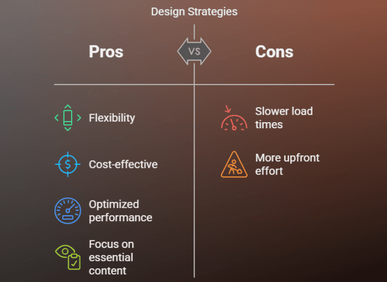
1. Responsive Design
- Definition: Create a single design that automatically adjusts to fit various screen sizes.
- Pros: Flexibility and cost-effectiveness.
- Cons: Can lead to slower load times if larger images or desktop-specific elements are also served to mobile users.
2. Mobile-First Design
- Definition: Begin with the smallest screen size and adapt upwards, focusing on essential content for mobile devices first.
- Pros: Optimized performance for mobile users, strong emphasis on crucial content and functionality.
- Cons: Requires more upfront effort in design and development.
Choosing the right strategy depends on business objectives and audience. If a large portion of your traffic comes from mobile devices, a mobile-first approach can yield stronger results. Moreover, discovering the best tools for streamlining UI/UX design—including wireframing and prototyping solutions—can help refine your design strategy and ensure that your site or app offers an optimal mobile user experience.
Further Reading:
For a curated list of UI/UX tools that can simplify your design workflows, check out Your Guide to the Best Software for Streamlining UI/UX Design Processes. It covers top picks for 2024 and how to choose the right platform for your project’s needs.
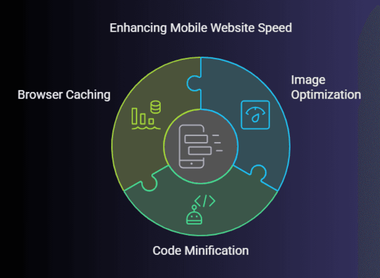
Mobile Website Speed: Optimizing Performance for Seamless User Experiences
Site speed remains a critical factor in mobile optimization. When pages load slowly, users become frustrated and bounce. In fact, Google’s research (Think Mobile) shows that 53% of mobile users abandon sites taking longer than three seconds to load. Below are strategies to keep mobile website speed at its peak:
1. Image Optimization Techniques
- Compress images with Squoosh to shrink file sizes without sacrificing quality.
- Convert images to WebP (WebP: Google’s image format for faster and smaller web) whenever possible for enhanced efficiency.
- Use Squeezeimg for bulk compression and quick processing of multiple image formats.
2. Code Minification for Faster Loading
- Remove unnecessary characters from HTML, CSS, and JavaScript files to accelerate load times.
- Tools like Terserhelp minify and optimize code, resulting in quicker rendering.
3. Browser Caching to Reduce Server Load
- Use caching to store static resources locally on the user’s device, minimizing server requests.
- Implement service workers or set cache headers to further boost performance.
By improving mobile site speed, businesses not only enhance user satisfaction but also see positive effects on search engine rankings—an important component of overall SEO.
Mobile Touch: Designing Intuitive Navigation and Interactions for Enhanced Usability
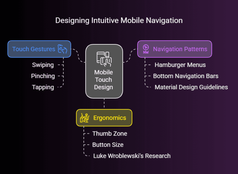
Crafting interfaces for touch screens requires understanding how people physically interact with their devices. Best practices include:
1. Incorporating Touch Gestures for Enhanced Interactivity
- Implement common gestures such as swiping, pinching, and tapping to make the interface more engaging.
- Libraries like Hammer.js provide easy ways to handle these touch events.
2. Utilizing Clear Navigation Patterns
- Employ intuitive navigation systems like hamburger menus or bottom navigation bars.
- Reference established guidelines such as Material Design for recognized patterns and microinteractions that help guide the user.
Further Reading:
Dive deeper into microinteractions with Microinteractions in UI/UX Design: A Complete Guide to Boosting User Engagement—it explains how small design details can greatly enhance user satisfaction.
3. Designing User Interface Elements for Optimal Ergonomics
- Ensure buttons and interactive elements are large enough to be tapped easily, taking into account the “thumb zone” on mobile screens.
- Luke Wroblewski’s research on the thumb zone offers valuable insights into designing for ergonomics.
Creating intuitive mobile navigation ensures that users can effortlessly locate content and features, elevating the mobile user experience and leading to higher engagement and satisfaction.
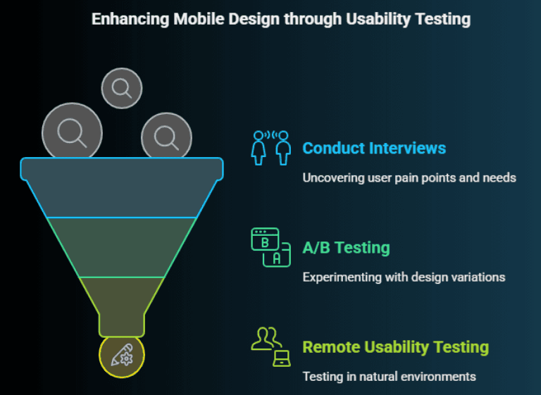
Mobile Design Validation: Essential Usability Testing Techniques for Optimal User Experiences
To guarantee a small screen interface meets user needs, thorough usability testing is key. By observing real users, you can pinpoint where friction occurs and how to improve. Common testing methods include:
1. Gathering User Insights through Interviews
- Conduct qualitative research to uncover user pain points and needs.
- Platforms like UserTesting facilitate remote interviews, giving you direct feedback from real users.
2. Conducting A/B Testing for Design Optimization
- Experiment with multiple design variations to see which performs best.
- Google Optimize is a popular tool for running A/B tests.
- AI can significantly streamline research, analyzing user patterns to drive data-driven design choices.
3. Performing Remote Usability Testing for Authentic Feedback
- Test in the user’s natural environment to gain genuine insights.
- TryMyUI enables remote usability testing for a more diverse audience.
Collecting and reviewing feedback empowers designers to iterate effectively, ensuring a truly seamless mobile experience. If leveraging AI, be mindful of the ethics in AI-driven UI/UX design, maintaining responsible use of data and privacy.
Further Reading:
- For insights on ethical AI integration in design, see Ethics in AI-Driven UI/UX Design: Balancing Innovation and User Privacy.
- Learn how AI can speed up user research and prototyping in From Data to Design: Leveraging AI for UX Research and Prototyping.
How Mobile-First Approach Impacts Core Web Vitals
One critical aspect of modern SEO is Core Web Vitals, which focus on key user experience metrics such as Largest Contentful Paint (LCP), First Input Delay (FID), and Cumulative Layout Shift (CLS). A mobile-first design can directly influence these metrics:
- LCP: By prioritizing the mobile layout, you ensure essential content loads quickly for smaller screens.
- FID: Mobile-friendly code minimization (via Terser) reduces JavaScript bloat, leading to faster interactivity on mobile devices.
- CLS: Simplifying design for small screens often removes clutter, reducing unexpected layout shifts.
Meeting or exceeding Core Web Vitals contributes to higher search engine rankings and a more positive user experience across all devices, especially on mobile.
Key Takeaways
- Mobile-First Mindset: Start designing for small screens and scale up—this ensures mobile optimization from the ground up.
- Speed and Performance: Use techniques like image compression and code minification to accelerate load times and meet Core Web Vitals thresholds.
- Intuitive Navigation: Employ common touch gestures and ergonomic UI elements to create frictionless user journeys.
- Usability Testing: Conduct interviews, run A/B tests, and gather authentic feedback to refine the mobile user experience.
- Focus on SEO: Recognize that mobile-first indexing and Core Web Vitals significantly impact rankings, making optimized mobile design an essential business strategy.
FAQ
Below are some frequently asked questions about mobile-first design, presented in a simple text format for easy reference:
Q: Why is a mobile-first approach important for SEO?
A: Google uses mobile-first indexing, meaning the mobile version of your site is primarily used for ranking. Prioritizing mobile design enhances user engagement and meets Core Web Vitals, both of which influence SEO.
Q: How does mobile-first design differ from responsive design?
A: Mobile-first focuses on designing for smaller screens first, then adapting to larger ones. Responsive design creates a single layout that scales up or down to fit various screen sizes. Mobile-first is often better for performance optimization on mobile devices.
Q: Which tools can help optimize my mobile website speed?
A: Tools like Terser for code minification, Squoosh.app for image compression, and service workers for caching can significantly boost mobile site speed, improving both user experience and overall SEO.

Conclusion
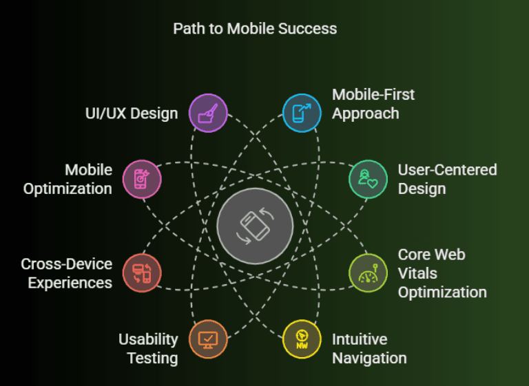
By adopting a mobile-first approach and integrating user-centered design principles, businesses can create mobile-friendly experiences that go beyond basic functionality to truly engage and delight users. From Core Web Vitals optimization to intuitive navigation and rigorous usability testing, the steps to mobile success are clear.
At Pinta WebWare, we specialize in crafting seamless, cross-device experiences that enhance user satisfaction and drive tangible business results. Contact us today to discover how our expertise in mobile optimization and UI/UX design can elevate your brand’s online presence.