UI/UX Design
Performance optimization
Marketing strategies
Why Your Ads Fail Without UX and CRO
Nadiia Sidenko
2025-04-11
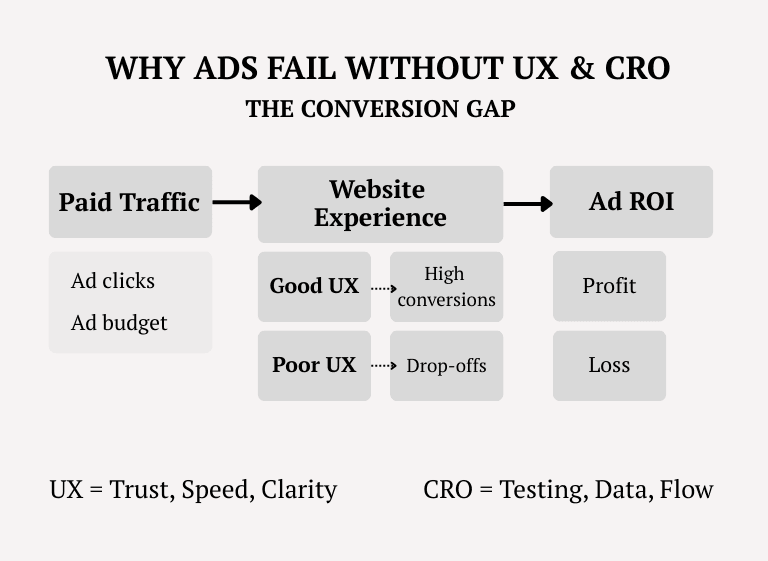
You're spending hundreds—or thousands—on paid ads, but conversions are still flat. Sound familiar? The truth is, UX optimization for better ad performance isn’t a nice-to-have—it’s the missing link. A seamless user experience and conversion rate optimization for paid traffic directly impact how your ads perform, from quality score to ROI. In this article, you’ll discover how poor UX drains your ad budget, what to test and improve, and why strategic advertising and promotion can’t work without CRO fundamentals.

Why UX & Site Performance Impact Ad Campaign Success
Your ad campaign can only go as far as your website allows. No matter how compelling your message or how precisely you’ve targeted your audience, if your landing page is slow, confusing, or untrustworthy, users will bounce before they ever convert.
Website performance optimization is more than a technical metric—it’s a direct driver of ad quality scores and cost-per-click. A poor user experience increases bounce rates, lowers engagement, and ultimately inflates your ad spend without delivering results.
We’ve seen this firsthand: companies invest in strategic advertising and promotion only to watch performance stall due to overlooked UX issues.
And while platforms like Google consider UX in their ranking algorithms, what really matters is how real users react in the first five seconds. Are they staying? Clicking? Or leaving? That’s where true ROI is made or lost.
How Website Performance Influences Ad Quality Scores and CPC
When your website loads slowly or breaks under traffic, advertising platforms notice—and penalize. Google Ads, for instance, directly ties landing page experience to your quality score. And that score affects how often your ads are shown, where they appear, and how much you pay per click.
In other words, poor performance doesn’t just frustrate users—it silently raises your ad costs. You may be paying 20–30% more per click than a competitor with a faster, better-optimized site, even if you're targeting the same audience with the same message.
Improving website performance optimization can instantly enhance your campaign’s efficiency, especially in competitive industries where CPC margins are tight. And yet, many companies overlook this, focusing only on creative and forgetting the destination page is just as critical as the ad itself.
The Link Between Slow-Loading Pages and Higher Bounce Rates
You’ve got just a few seconds. If your page doesn’t load—your visitor is gone. It’s that simple. Some studies suggest that even a one-second delay in page load time can lead to a noticeable drop in conversions, particularly in performance-driven campaigns.
Slow-loading pages create friction right at the entry point. Users don’t wait. They return to the search results, click a competitor’s ad, and your cost-per-click becomes a sunk cost.
And it’s not just about speed for speed’s sake—performance influences trust. Users subconsciously associate a sluggish website with low reliability, especially in e-commerce or B2B services, where trust is everything.
As HubSpot highlights based on research from Akamai, Google, and Deloitte, even slight delays can significantly hurt conversion rates, bounce rates, and engagement metrics. This makes website performance optimization not just a technical issue—but a strategic priority.
Why User-Friendly Navigation Is Crucial for Ad-Driven Traffic
When users arrive on your site through an ad, their attention is razor-thin. They didn’t come to explore—they came to act. That’s why cluttered layouts, unclear menus, or too many options can immediately derail the journey.
Ad-driven traffic is often cold or semi-warm: users don’t know your brand yet, and every extra click is a chance to lose them. Clear, intuitive navigation becomes a silent salesperson—guiding them exactly where they need to go with minimal friction.
We've worked with businesses that spent heavily on paid ads but lost conversions simply because visitors couldn’t find the product, service, or action they came for. In contrast, those who invested in best practices for conversion-driven UX saw instant improvements in retention and conversion metrics.
So while ad creatives get all the glory, it’s seamless site structure that quietly determines whether a user completes their journey—or abandons it halfway.
A/B Testing for Landing Pages & Checkout Optimization
Even the best-performing ad can fall flat if the landing page doesn’t convert. That’s where A/B testing comes in—not as a guessing game, but as a data-driven approach to uncover what actually drives users to act.
As outlined in our marketing strategies for SaaS and e-commerce websites, ad-driven visitors behave differently. They expect clarity, relevance, and instant alignment between what they clicked and what they see. Without testing, it’s nearly impossible to match those expectations at scale.
In our experience, companies that systematically test landing pages and optimize checkout flows for higher sales consistently outperform competitors who rely on instinct alone. It’s not just about layout—it’s about aligning the entire experience with what users expect and need in the moment.
How to A/B Test Landing Pages for Better Ad Conversions
Not all traffic behaves the same—and not all pages convert equally. That’s why A/B testing isn’t just a tactic; it’s a strategic necessity when running paid campaigns.
The goal isn’t to find the “perfect” landing page, but to continually refine what works best for your audience. It starts with hypotheses—what if we shorten the form? Change the CTA wording? Remove a distracting element?
But here’s the catch: real impact comes from structured testing, not random changes. Businesses that treat A/B testing as part of their ongoing UX optimization for better ad performance see measurable increases in both conversions and ad efficiency.
And yet, many skip it. Why? Because running proper A/B tests—setting variables, isolating factors, interpreting results—takes time, tools, and expertise. Something most internal teams struggle to manage alongside active campaigns.
What Elements Should Be Tested: Headlines, CTAs, Visuals
In paid traffic scenarios, users make decisions in seconds—sometimes less. That’s why micro-changes to page elements can lead to macro shifts in results. The most impactful areas to test are often the simplest:
- Headlines — They’re the first thing visitors read. Does the headline reflect the ad they clicked? Does it promise value or just describe a product?
- CTAs (Calls to Action) — Button text, placement, size, and color all influence whether users take action or bounce. A small tweak can double engagement.
- Visuals — Hero images, product shots, even background colors influence perception and trust. For ad-driven traffic, alignment between ad visuals and landing visuals is key.
The mistake many businesses make is assuming these elements "look fine"—but without testing, there’s no way to know what actually works. Effective A/B testing for landing pages is about validating every assumption with data, not gut feeling.
A/B Testing Tools: Why Strategy Matters More Than Software
With so many platforms offering “easy A/B testing,” it’s tempting to think the tool will do the work for you. But the truth is, tools don’t test—people do.
An A/B test is only as effective as the thinking behind it. If you test too many variables at once, stop a test too early, or track the wrong metrics, you won’t get insights—you’ll get confusion. These are common pitfalls we’ve seen across businesses trying to optimize landing pages on their own.
Whether you’re using a simple plugin or a robust enterprise solution, the outcome depends on how clearly you define your goals, how rigorously you run the experiment, and how well you understand user behavior.
That’s why successful conversion rate optimization for paid traffic isn’t just about installing software. It requires strategic planning, careful monitoring, and ongoing refinement—often with expert support.
Optimizing Checkout Flows for Higher Sales
For e-commerce and subscription-based businesses, the checkout page is where all your ad spend either pays off—or vanishes. Even minor friction at this stage can kill conversions. Slow-loading fields, too many steps, unclear payment options… users drop off fast.
How checkout optimization boosts e-commerce sales is not about fancy design—it’s about clarity, speed, and trust. Businesses that treat checkout as a strategic UX element, not a backend formality, often recover thousands in lost revenue.
We’ve seen brands cut abandonment rates simply by streamlining form fields or surfacing trust signals at the right moment. But identifying what’s causing friction isn’t always obvious. That’s why optimization isn’t about guesswork—it’s about data, empathy, and experience.
How Simplifying Checkout Processes Improves Conversion Rates
Simplicity isn’t just nice to have—it’s conversion fuel. The fewer the steps, the lower the friction, and the higher the chances your paid traffic actually converts.
From removing unnecessary fields to consolidating steps, simplifying the checkout process gives users less time to hesitate and fewer chances to abandon the cart. And when every click has a price, reducing drop-offs means maximizing return.
What seems like a small UX tweak—like auto-filling data or collapsing sections—can lead to measurable gains. But these changes require more than intuition. Real results come when checkout design is aligned with user behavior, tested against actual drop-off points, and adapted for different devices.
Importance of Trust Signals, Payment Options, and Mobile Usability
When it comes to checkout, confidence is everything. Users arriving from paid ads don’t have an existing relationship with your brand—they decide in seconds whether to trust you with their money.
That’s why trust signals—like security badges, reviews, clear refund policies—aren’t just design extras. They’re decision triggers. Their absence can silently kill conversions, no matter how good your offer is. Equally critical are payment options and mobile usability. If users can’t pay the way they prefer, or if the mobile version of your checkout is clunky, they’ll bounce—fast. Especially for ad-driven traffic, mobile-first design is no longer optional.
Smart businesses audit their checkout experience from the user’s point of view. And those who prioritize conversion rate optimization for paid traffic know: trust and accessibility close the sale.
The Role of Heatmaps & User Behavior Tracking
Traditional analytics tell you what happened—bounce rates, exit points, session duration. But they rarely explain why. That’s where heatmaps and behavior tracking come in.
These tools reveal how users interact with your site: where they click, how far they scroll, what they ignore. For paid traffic, this insight is gold. It shows not just whether your ad brought users in—but whether the page delivered what they expected.
In many cases, companies spend thousands on ads only to lose users at predictable friction points: a CTA too low, a visual that draws attention away, a form that looks intimidating. Tools like Enhanced eCommerce modules allow you to trace those patterns in detail.
Understanding user behavior isn’t optional if you want to convert ad traffic. It’s the only way to fine-tune your site based on real interaction—not assumptions.
How Heatmaps Help Identify UX Issues
You can’t fix what you can’t see. That’s the power of heatmaps—they turn user behavior into a visual story.
Instead of guessing where users struggle, heatmaps show you exactly what’s being clicked, skipped, or ignored. Are visitors focusing on decorative elements instead of the CTA? Are they scrolling but not interacting? That’s where UX optimization for better ad performance begins—not in theory, but in behavior.
For businesses running paid ads, this insight is critical. A misaligned layout or a misplaced CTA can quietly burn your budget. Heatmaps surface those blind spots and give you the evidence needed to act—strategically, not instinctively.
Understanding User Interaction with Landing Pages
Landing pages aren’t just containers for ad traffic—they’re decision-making environments. And every scroll, pause, or ignored section tells you whether that environment is working or not.
With heatmaps and behavior tracking, you can finally see how users experience your page. Are they stopping at a headline? Skipping over trust elements? Scrolling past your offer without clicking? These patterns reveal gaps in clarity, flow, or relevance.
And for campaigns driving paid traffic, every one of those moments matters. Effective landing page design for paid traffic means more than visuals—it means understanding how users interact with your layout in real time, and adjusting based on evidence.
How to Optimize CTA Placements Based on Heatmap Data
Great calls to action don’t just depend on copy—they depend on placement. You can have the most persuasive button in the world, but if users never see it, it won’t convert.
Heatmaps help identify this disconnect. Are users clicking elsewhere? Are they stopping their scroll before reaching the CTA? Are they distracted by competing elements? With this data, optimization becomes focused: move the CTA, test its visibility, reduce noise around it.
Brands serious about using behavioral analytics to improve conversions don’t leave CTA performance to chance. They track what users do, compare it to what they should do, and optimize accordingly. That’s how small UX changes drive big ROI from paid campaigns.
Using Behavioral Analytics to Reduce Drop-Off Rates
Not all drop-offs are obvious. Some users leave because the page didn’t load. Others because they didn’t find what they expected. But often, they leave because of subtle friction points that go unnoticed—unless you're tracking behavior.
Behavioral analytics uncovers those patterns. It shows how users move, click, hesitate, and exit. Are they hesitating on pricing sections? Abandoning forms halfway? Clicking back after a few seconds? These signals tell a deeper story—one that can’t be seen through traffic volume alone.
Companies that invest in advanced user tracking and heatmaps don’t just monitor—they adapt. They spot behavioral bottlenecks early and make targeted changes that reduce bounce and increase engagement across ad funnels.
How Behavioral Tracking Helps Refine Ad Targeting
Ad targeting doesn’t stop when the user clicks. What happens after the click can be just as valuable for shaping future campaigns. That’s where behavioral tracking steps in—not to just measure engagement, but to understand intent.
If users consistently drop off after the product page, maybe the offer doesn’t match the ad’s promise. If they hover over certain content but don’t convert, maybe that’s the message to amplify next time.
Smart brands use behavioral insights not just to improve UX—but to inform ad creatives, audience segmentation, and messaging. That’s how using behavioral analytics to improve conversions becomes a feedback loop: better insights, better targeting, better ROI.
Key Metrics to Monitor: Session Duration, Click Patterns, Exit Rates
Not all metrics carry equal weight. When optimizing for ad-driven traffic, vanity numbers like total sessions or pageviews can mislead. What matters is how users behave once they arrive.
- Session duration shows engagement depth. Are users actually exploring—or bouncing within seconds?
- Click patterns reveal decision paths. Are users following your funnel or getting distracted?
- Exit rates pinpoint where the journey ends. Are users leaving from the product page, the form, or the checkout?
These metrics, when viewed in context, uncover what’s working—and what’s quietly draining your budget. Effective conversion rate optimization for paid traffic means knowing which numbers to trust, and how to act on them.
Best Practices for CRO (Conversion Rate Optimization)
Conversion isn’t just the end goal of a campaign—it’s the product of dozens of small decisions across your entire digital experience. And for businesses investing in paid traffic, conversion rate optimization is where your budget starts working smarter, not harder.
As outlined in our guide on tracking and measuring advertising performance, optimizing what happens after the click is often what separates effective campaigns from wasted spend.
While each business is different, the path to higher ROI follows a few universal principles: clarity in messaging, simplicity in flow, relevance in content, and trust at every stage.
But here’s the reality—CRO isn’t a checklist. It’s a continuous process of testing, learning, and refining. And when done right, it transforms your website from a static destination into a performance engine that turns visitors into customers.
Designing High-Converting Landing Pages for Paid Traffic
Paid traffic arrives fast—but leaves even faster if the landing page fails to deliver. High-converting pages don’t happen by accident; they’re intentionally crafted with every element supporting the user’s decision to act.
The key is alignment: between the ad message, the landing page content, and the visitor’s intent. If there’s even slight dissonance—visually or verbally—conversion rates plummet. This is where landing page design for paid traffic becomes a strategic discipline, not just a design task.
Strong landing pages combine persuasive copy, focused layout, and a single, clear action. But knowing how to execute that balance—and for whom—is what separates guesses from growth. That’s why successful brands iterate, test, and refine constantly, guided by behavior and performance data.
Persuasive Copywriting and Visual Hierarchy
Good design attracts attention. But it’s copy that converts. On landing pages, every word carries weight—and every visual choice either supports the message or distracts from it.
Effective conversion-driven UX starts with clear, benefit-led copy that speaks to the visitor’s problem and positions your offer as the solution. No fluff, no filler—just relevance.
But even strong copy falls flat without visual hierarchy. Headlines must command attention. CTAs need to stand out. Supporting text should be scannable, not overwhelming. When words and visuals work together, the user flows effortlessly toward the action.
Role of Video Content in Boosting Engagement and Conversions
Video is no longer a “nice to have”—it’s often the fastest way to build trust with cold traffic. Especially for ad-driven visitors, a short, well-placed video can do what a paragraph never could: demonstrate, reassure, and convert.
Whether it’s a product demo, testimonial, or brand explainer, video increases time on page and reduces bounce. But just embedding a video isn’t enough. It must serve a clear purpose, match the landing page message, and appear at the right moment.
Used strategically, video content becomes part of your conversion rate optimization for paid traffic—guiding users from curiosity to confidence without needing to scroll.
Reducing Friction in the Customer Journey
Every extra step, hesitation, or moment of confusion is a potential exit point. For paid traffic, where every visitor has a cost, that friction isn’t just a UX issue—it’s a revenue leak.
The most effective ad campaigns don’t just deliver clicks. They deliver fluid user journeys—from first impression to final conversion. And that means removing anything that slows the user down: redundant steps, competing CTAs, unclear messaging, or distracting visuals.
What seems minor from the brand’s side often feels major to the user. And that’s why customer journey friction reduction is a key pillar of any serious CRO effort. You’re not just optimizing pages—you’re streamlining decisions.
Minimizing Distractions and Streamlining User Flow
Clutter is the silent killer of conversions. When users are overloaded with choices, pop-ups, or conflicting messages, they freeze—or worse, they leave.
Reducing friction means giving users a clear path to action. One primary CTA, clean layout, logical progression—that’s how you streamline flow and reduce drop-offs.
This doesn’t mean oversimplifying. It means focusing. Every element on the page should serve a single goal: helping the user move one step closer to conversion. Everything else is noise.
Case Examples of Improved Conversion Through UX
We’ve seen firsthand how small UX adjustments can lead to significant gains. In one SaaS project, restructuring the onboarding flow noticeably increased trial sign-ups. In e-commerce, moving key product details above the fold helped reduce bounce rates and improve click-through to checkout.
These weren’t dramatic redesigns—they were targeted, data-driven changes based on real user behavior. That’s the power of UX in practice.
Improving conversion rates through UX isn’t theory—it’s a measurable advantage. And for businesses spending on ads, it’s often the difference between break-even and breakthrough.
Case Studies: How Businesses Improved Their Ads Through UX Optimization
UX optimization isn’t just a theory—it delivers measurable results across industries. From SaaS platforms to e-commerce brands, we’ve seen how targeted improvements in design, navigation, and user flow help turn underperforming ads into high-converting funnels.
In this section, we’ll explore examples where even modest UX adjustments led to stronger campaign ROI—not through major redesigns, but through understanding behavior, testing assumptions, and removing conversion blockers.
SaaS Case Study: Increasing Sign-Ups by Optimizing the Onboarding Process
For SaaS businesses, sign-ups are the gateway to revenue. But when users arrive from paid ads, their expectations are high and their patience is short. That’s why even a slight misstep in the onboarding flow can lead to immediate drop-off.
In one project, we worked with a SaaS platform that was driving solid traffic through paid ads—but conversions remained flat. Through behavioral analytics, we discovered that users were hesitating at the second onboarding step due to unclear instructions and lack of perceived progress.
By simplifying the flow, clarifying guidance, and adding visual cues to signal completion stages, the client saw a noticeable improvement in sign-up rates—without changing the ad campaign itself.
This case highlights a core truth: conversion rate optimization for paid traffic isn’t always about bringing in more users—it’s about making sure the right users stay and succeed.
E-Commerce Case Study: Enhancing Product Pages for Higher Ad ROI
In e-commerce, the product page is where the ad promise meets real-world decision-making. And if that page doesn’t deliver—visually, emotionally, or functionally—users leave, and ad spend is wasted.
We partnered with an online retailer that had strong ad creatives and healthy click-through rates, but conversions lagged behind. Heatmap analysis revealed a key issue: critical product information was buried below the fold, and the CTA was competing with less relevant elements.
By reorganizing the layout, elevating key details, and creating a more focused visual hierarchy, we helped the brand align its landing experience with user intent. The result? A clearer path to purchase, reduced friction, and improved return on ad spend.
This case shows how UX optimization for better ad performance often starts with small, strategic tweaks—not massive redesigns.

Conclusion
Why UX & CRO Are Essential for Ad Success
Clicks don’t equal conversions—and ad budgets don’t guarantee results. The real power of paid campaigns lies not just in how you attract users, but in what happens after the click.
That’s where UX and CRO take over. Without fast-loading pages, intuitive navigation, and trust-building design, even the best ads fall flat. And without testing, tracking, and improving, most of your budget goes toward learning the hard way.
The smartest brands don’t just launch campaigns—they optimize the entire journey. They treat conversion rate optimization for paid traffic not as an afterthought, but as a core strategy.
What should always be tested? The path to action. Headlines. CTAs. Load speed. Trust signals. Every element users touch.
What’s coming in 2025? More personalization. Predictive UX. AI-assisted CRO. And with that—higher user expectations.
If your ads aren’t performing, maybe it’s not the targeting. Maybe it’s what users find when they arrive.